
But these mistakes are easy to fix! Read on about two common font errors and how to fix them...
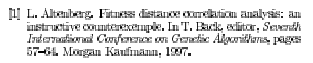
Computer Modern is by default a bitmapped font. That means that each symbol is rendered as a bunch of dots, rather than as an outline equation. PostScript fonts, TrueType fonts, and other modern fonts are rendered as outline equations. Outline equations scale indefinitely to arbitrarily high precision. Bitmaps look like bitmaps. Here's an example of the word "Conference", in Computer Modern Italic at 12pt bitmapped, blown up 400%:
You can see the bitmaps in action. That's what it looks like printed on your printer, if you look really close. Most Computer Modern users don't notice, because current LaTeX systems render their bitmaps at 600dpi, which is enough for many laser printers, though still bad quality for good webpresses. But bitmaps bulk up your paper considerably and slow down printing. But that's not the big problem. The big problem is that, as far as PostScript and PDF is concerned, your Computer Modern text is nothing but lots of tiny bitmaps. Lacking true information about what the font's really supposed to look like, many PDF viewers, like Acrobat Reader, will antialias the bitmaps, resulting in a nasty mess. Here's a snippet of an actual Computer Modern paper I reviewed, when viewed in Acrobat Reader at 100%:
That's pretty typical of Computer Modern papers. Again, this is because LaTeX here isn't actually using real fonts -- it's really constructing a PDF consisting of thousands of little bitmap pictures. Yuck!
Fortunately, you can fix this, but you'll have to figure out how to set it up on your system. Modern LaTeX distributions, particularly teTeX, come with PostScript (outline equation) versions of Computer Modern. These are known as the "Blue Sky" Computer Modern fonts, and they're free. Unfortunately, these distributions usually have the PostScript versions turned off by default. You'll need to figure out how to turn them on in your system. In tetex, you might be able to do it by editing the file /usr/local/teTeX/share/texmf/dvips/config/updmap, and turning on the type1_default=true switch, then executing the updmap script. This may or may not work. If you don't have the Blue Sky fonts on your system, you can download them for free from the American Mathematical Society. I can say that tetex/TeXShop.app for MacOS X has the fonts turned on by default now.
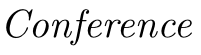
Here's Conference again, this time using the Blue Sky Computer Modern fonts, blown up to 400%:
Ahhhh... finally a professional look. And I retyped the above bibliographic entry, only using the Blue Sky Computer Modern font. Here's what it looks like in Acrobat Reader, shown at 100%:
As you can see, a huge difference in readability. It looks even better with ClearType turned on.
It's not a good thing to be publishing PDF documents with Computer Modern bitmaps. Even the lowliest information technology worker is pumping out Microsoft Word documents using good-quality outline fonts. As AI researchers, we're claiming to have a modicum of computer experience, aren't we? Bitmap fonts are computer technology that's twenty years out of date. We need to get with the program.
If your paper has no math in it, another option is to do \usepackage{times} etc. to use a modern outline PostScript font such as Times Roman, New Century Schoolbook, etc. Here's the same text in Times Roman:
However, if you use any math, the math will still be in the Computer Modern bitmaps. So regardless, it's well worth it to get the Blue Sky Computer Modern fonts working right on your system.
Okay, that's over. But there are two real, serious problems with Computer Modern: first, it is a very very wide font, which translates directly into you not being able to write nearly as much text in your conference paper. By substituting another font you can often get well over 30% more room on a page to type more stuff. Second, lots of authors are (unfortunately) using Microsoft Word for conference papers. No system except for TeX has the Computer Modern font: thus if a conference wants to have a consistent look from paper to paper, something has to give. And usually that means abandoning Computer Modern and going with Times Roman.
Now I'm not going to claim that Times Roman is a great looking font either --- it's not, and I'd much prefer something else, though I do think that Computer Modern is worse. But my feelings aside, Times does have three things going for it: it's available on everyone's system, it's available on every laser printer (so doesn't have to be embedded inside your PDF document, saving lots of space), and it packs a lot of text in a small space while still remaining reasonably readable.
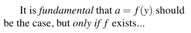
Switching to Times causes a problem for math users, though: Times Roman doesn't have the symbols necessary to render LaTeX's equations. Thus LaTeX must revert to Computer Modern to handle the math, even when it displays text in Times. Even after you've set LaTeX up to use Blue Sky Computer Modern, you're going to get text like this:
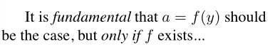
Notice that the cursive a's and f's look different from one another. This example doesn't really do the problem justice: you have to see the mix on a printed page. If you back up and look at a printed, mixed Computer Modern / Times document from a distance, you'll see that the Computer Modern just jumps right out. This is because the letterforms are spaced differently from Times, they're thinner and curvier, and at an odd slant. It's not a disaster to mix the two (I've done many such papers). But fixing this little bit of ickiness is really really easy, and you should consider doing it.
First, I should mention that you can purchase a Times-lookalike math symbol collection called mathtime from Y&Y. But if you're like me and don't want to cough up the $$$, there's another great option: use the \usepackage{mathptm} package in combination with the \usepackage{times} package. Mathptm substitutes as many PostScript Symbol and Times glyphs as possible in the equations, resorting to Computer Modern only for the unusual ones. This results in very consistent looking text:
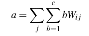
There's a problem with this second approach, though. The Symbol PostScript font has some downright ugly glyphs. The worst one is the capital Sigma, used in summations. Hence the following math prettily rendered in Computer Modern:
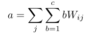
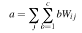
...turns into the following monstrosity when using mathptm:
This is almost entirely a problem with the "big symbols" (Sigma, Integrate, etc.). Fortunately, you can fix this to look better and still have a consistent Times "look" throughout your paper. Edit your mathptm.sty file (mine is in /usr/local/teTeX/share/texmf/tex/latex/mathptm/mathptm.sty) and change the following line:
\DeclareSymbolFont{largesymbols}{OMX}{psycm}{m}{n}
...to...
\DeclareOption{bigsym}{\DeclareSymbolFont{largesymbols}{OMX}{psycm}{m}{n}}
\ProcessOptions
This by default sets up mathptm to use Times and Symbol for all the math symbols it can find, except for the big symbols like Big Sigma. Here's what the equation looks like now:
Try it! I think you'll like it, and it'll make your paper look much more professional with very little work. And with this modification in place, if for some reason you still want to use the big Times/Symbol symbols, you can always revert to "true" mathptm by saying \usepackage[bigsym]{mathptm}.